- Home
- Breitling Models
- Movements & Calibers
- Bracelets & Straps
- Breitling User Manuals
- Chronologs & Books
- Articles & FAQ
- Reviews
- Breitling Ambassadors
- Forum
- Glossary
- Downloads
- Complete Pricelist
- Contact & Links

Breitling Articles, FAQs and Resources
Spotting the Good Fakes
Spotting the Good Fakes - 06/06/2008
It used to be easy to see the difference between real and fake Breitlings with a little bit of knowledge, but now even the pros can be fooled. I've written this article to help you identify the errors in the very well made fakes on the market so you don't get duped.
There are a few ways to see what the differences are in the good fakes usually:
- Date Font
- Luminous Paint
- Movement
- Bracelet
Date Font
Date font is never correct between the replicas and the real models, unless it is an modifcation done afterwards by modders out there that try to improve the manufactured fakes.
Below is an example of a fake SuperOcean Steelfish and a real one. Not all real Breitlings have the same date font either so do not use these examples as definitive.


Notice that the real date font fills the space a little bit better than the fake one. It is typical of Breitling date fonts to try and fill the space with the number evenly.
Luminous Paint
One of most poorly done things on the replica Breitlings is the luminous paint. They are rarely painted on properly and typically do not reach all the edges of the indexes that they are painted on.
The example below shows a real Breitling Chronomat evolution and a fake, and how the paint on the fake leaves out little bits around the edges and corners due to poor quality control and craftmanship.


This appears to be a common theme among the fakes and I think should be quite reliable in idenifying them as of this writing.
Movement
Usually, fakes do not have decorated movements, however this is beginning to change. Most fakes have a plain chinese made copy of the movement, as shown below.


More and more I am seeing decorated fake movements, that are not really decorated properly. As you can see, the real Breitling Caliber 13 movement below has the Breitling Logo in block letters. The fake ones I have seen have all had the Breitling Script logo rather than the block letters.
Some models of Real Breitling have the script logo on the rotor decoration of the movement as well, so the script is not a guarantee of a fake movement either. The machine turned decoration on the movement does appear to be missing however on the fakes, even with the decorated rotor. As you can see above there should be extensive pearlage and circular paterning on the authentic movement.
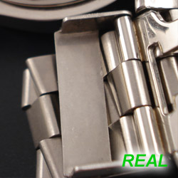
Bracelet
The Bracelets are often the easiest things to spot the authenticity of, however that doesn't mean that the watch is real or fake either, as a fake bracelet can be put on a real watch, and vice versa.
Below are pictures of the Screw Holes on the opposite side of the bracelet as where the screws go in. These examples are of a Pro and Pro II bracelet. Notice on the fake, the dimples are curved, whereas on the real one, they are flat. Depending on the bracelet you get (pilot, navi, pro, etc) the real bracelet may be completely flat or slightly curved in the dimple. The replica models however always have a very curved appearance as you can see from the photo.


There is also a bit more visible on the back of where the logos are stamped on the fake bracelets. The real bracelets often have a LITTLE bit of visible stamping on the back, but not nearly as much as the fake bracelets as you can see from the photos below. Sometimes I get emails from guys saying they have some stamping visible on the back and they are worried they got a fake. This is not definitive as the real ones have a bit sometimes as well, just not as much as the fakes.

All Breitling Models - Forum - Contact Us - Privacy Policy - Breitling Blog